This post is about two Swift packages I just made public: SwiftDS, a SwiftUI design system, and SwiftBoard, a gallery that turns SwiftUI components into a website.
The funny part is that they didn't start as one project. They were two separate ideas that had nothing to do with each other. Then at some point I realized one was exactly what the other was missing.
Idea one: a design system as a package
The first idea was simple: build a design system for SwiftUI and ship it as a Swift package.
Every app I start ends up with the same pieces. A primary button, a text field with an error state, a card, a toast, a bottom sheet, some spacing constants, a color palette that I tweak five times. And every time I rewrite them, slightly differently, in a slightly different folder.
A design system fixes that by making those decisions once:
- Tokens for the things that repeat everywhere: colors, spacing, typography, radius, shadows, animations
- Components built on top of those tokens, so a button and a chip always agree on what "primary" means
- One place to change things, instead of hunting for
Color(hex:)across 40 files
Shipping it as a package means any app can add it with Swift Package Manager and start with a full set of components on day one.
What SwiftDS became
SwiftDS grew to 100+ components, split into categories: buttons, inputs, data display, navigation, feedback, layout, messaging, marketing sections, and analytics widgets with charts. It runs on iOS, macOS, watchOS, tvOS, and visionOS.
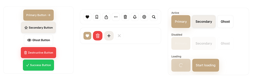
SwiftDS buttons: the variants, icon buttons, and disabled and loading states.
A few decisions I care about:
Tokens first
Everything reads from tokens. Spacing follows an 8pt grid, radius has named steps, and animations have names that describe intent instead of numbers:
VStack(spacing: DSSpacing.md) {
    DSButton("Get Started", variant: .primary) { }
}

DSAnimation.interactive  // spring, for buttons and toggles
DSAnimation.smooth       // spring, for sheets and overlays
When the numbers live in one place, the whole UI changes together.
A template, not a brand
I didn't want people to fork the package just to change a color. SwiftDS ships with a default sand palette, but the brand comes from the environment:
ContentView()
    .dsTheme(.brand(primary: Color(hex: "#234134")))
Every primary button, chip, link, and progress control in that subtree picks up the new color. You keep the component APIs and swap the look. If you need a one-off, most controls also take a color: for that instance only.
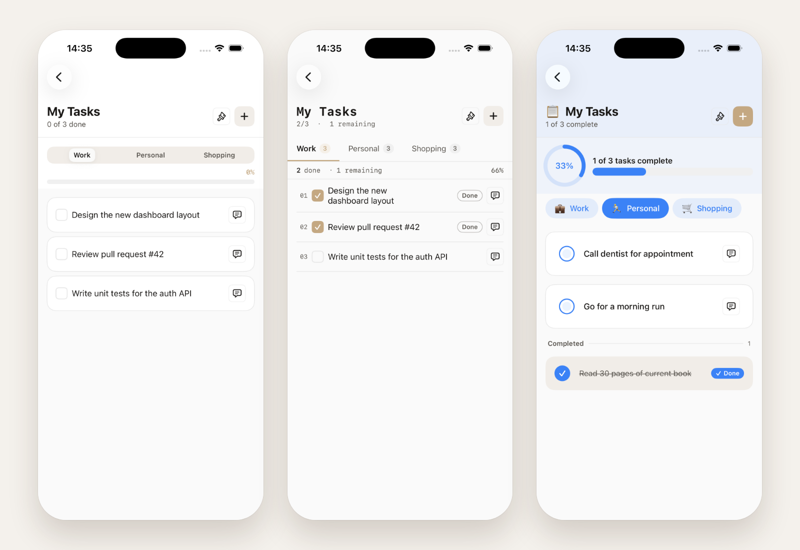
The Todo List showcase, built with SwiftDS, in three different styles.
Accessibility is part of the API
Components come with VoiceOver labels, hints, and traits, and text uses native text styles so Dynamic Type just works. It's much easier to get this right once inside a component than to remember it on every screen.
It shows up in Xcode
Every component is registered in Xcode's Library. Press ⌘⇧L, search for "DS", and drag it into your view. It sounds small, but it makes the package feel like part of the IDE instead of something you have to read docs for.
Snapshot tests
SwiftDS uses snapshot tests to keep documentation images aligned with the real components. When the docs site is checked out next to the package, a test run copies the fresh PNGs into it. So the screenshots on swiftds.luizmello.dev come from the actual SwiftUI code, not from a Figma file that drifted.
Idea two: a Playbook for SwiftUI
The second idea came separately, and at first it had nothing to do with the design system.
On the web, tools like Storybook let you see every component of a project, in every state, in a browser. iOS has its own take on this idea, Playbook-style catalogs. And SwiftUI has #Preview, which is great while you're coding, but it lives inside Xcode. A designer can't open it. A PM can't open it. You can't send someone a link to it.
So the idea was: what if a SwiftUI app could serve its own components as a website?
You'd register the states you care about in code, like a preview, and get a page where anyone can browse them.
Joining the two
At some point it clicked: a design system with 100+ components needs exactly that kind of gallery. And a gallery needs a real set of components to prove it works.
So the playbook idea became SwiftBoard, and SwiftDS became its first big catalog. Two birds, one package. Or, in this case, two packages that know about each other just enough.
How SwiftBoard works
The core idea: nothing is scanned from disk. The board shows whatever the running app registered. No code generation, no parsing Swift files.
You register states next to the component, a bit like a #Preview:
#if DEBUG
import SwiftBoardServer

extension AppButton: BoardScenarioProvider {
    static func provideScenarios(into board: SwiftBoard) {
        board.addScenarios(
            category: "Actions",
            component: "Button",
            summary: "Primary tappable action."
        ) {
            Scenario("Primary") { AppButton(title: "Continue") }
            Scenario("Disabled") { AppButton(title: "Continue").disabled(true) }
        }
    }
}
#endif
Then you attach it to your app, only in DEBUG:
WindowGroup {
    ContentView()
    #if DEBUG
    .swiftBoard {
        BoardScenarios.registerAll()
    }
    #endif
}
Run the app and a small server starts inside it. Open http://127.0.0.1:8080 and that's the board: every component and state you registered, as a website. You can also open it as a sheet inside the app.
Your production UI doesn't change. The server only exists in DEBUG builds.
Live board vs hosted board
This was the part that took me the longest to explain clearly, even to myself.
- Live board: the server runs inside your app. It's always up to date, but it only exists while the app is running. Stop the app and localhost dies.
- Hosted board: a static export. SwiftBoard renders every state to a PNG and writes a folder of HTML, CSS, JS, and images that you can put on Vercel, Netlify, or GitHub Pages. Designers open a public URL and nothing needs to be running.
The catch is that the export has to run on a Mac or the iOS Simulator. SwiftUI snapshots can't be generated on Linux, so a normal Vercel build can't do it. You export locally (or in a macOS CI job) and deploy the folder. Each export is a full snapshot of that build, so updating the hosted board means exporting again.
A note on the network
The server listens on every network interface, not just localhost. That's on purpose: it's what lets your Mac open the board served by a physical iPhone on the same Wi-Fi. But it also means anyone on that network can browse your components while the app runs, so don't run it on a café's Wi-Fi.
How the packages fit together
I wanted SwiftDS to stay a normal UI library that doesn't know SwiftBoard exists. So SwiftBoard ships in a few products from the same package:
- SwiftBoardServer: for your own design system. You register your components.
- SwiftBoardKit: the bridge to SwiftDS. One call,
SwiftBoardKit.registerAll(), puts the whole SwiftDS catalog on the board.
SwiftDS never imports SwiftBoard. Kit is the only place they meet. If you don't use SwiftDS, you just link Server and bring your own components.
Where it stands
Both packages are pre-1.0 and still moving. Components are still being added and refined, and a minor release can change an API until 1.0, so pin a version if you try them.
There's a lot I still want to do, but the part I'm happiest with is that the two ideas made each other better. SwiftDS gave SwiftBoard something real to show, and SwiftBoard made SwiftDS something you can actually browse instead of read about.
If you build SwiftUI apps, give them a try, and if something breaks or feels wrong, open an issue. That's the most useful thing right now.
Technical Resources
- SwiftDS: github.com/luizmellodev/SwiftDS-package
- SwiftBoard: github.com/luizmellodev/SwiftBoard
- Docs: swiftds.luizmello.dev
- Accessibility notes: ACCESSIBILITY.md